new ↑ ↓ old
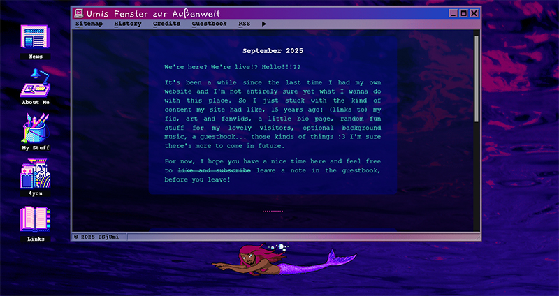
Version 6.0 - Underwater (September 2025)
15 years down the road we're back! I forgot so much about whatever I learned about webdesign ages ago, but nothing that a couple good tutorials can't fix. I even finally understand what CSS is. I originally wanted to focus a little more on accessibility with this layout, but. The siren call of the iframe and easy updates was too strong :,)
I started out with the basic old and trustworthy "navigation on the left, big content window on the right" idea, then I added the little mer!Jonas for the lulz. Next step was deciding on a color scheme. Saw a design with a fake explorer window in rainbow colors and got out some Win95 screenshots to built one myself. "Well, if I have an explorer window, oldschool Windows icons should be the navigation". Decided on a watery background so mer!Jonas wouldn't dry out. And that's how we ended up with this!
I still want to make it more accessible in the future, preferably even with a layout that works okayish enough on mobile, too. But for now, this is how my big comeback looks like.
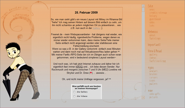
Version 5.0 - Caramella (February 2009 - 2010ish)
I really liked that little umbrella!Mike drawing at the time and the entire layout was just an excuse to use it on my page. Looking back I feel it's a massive downgrade from the previous layout on several levels, not even touching on whatever my laptop's screen at the time did to my choice of colors.
And yet, this was what my previous/original website looked like until the very end, when freenet.de stopped offering free webspace and closed the whole hosting section down. It was around that time I made a Facebook account to play Happy Aquarium, shortly after twitter became a thing, then tumblr (for me). And everyone was almost only on social media anymore.
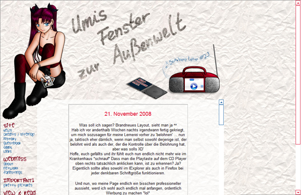
Version 4.0 - Empty Sketchbook (November 2008)
I think this one's still my favorite among my old website's designs. The Aileen header, the little CD player... I still have a second version of that header on my harddrive where she wears a crudely drawn Santa hat and scarf that I used in December, once I properly started to feel bad for her being dressed like that in winter lol
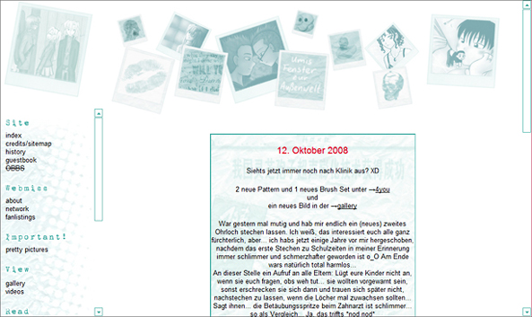
Version 3.1 - Photograph (August 2008)
I kind of went back to my roots with this one and went for more space for the actual content and a simpler navigation. There was a version 3.0 that had an even simpler design, but I got feedback that it looked a little too clinical. Also the first time I went with dark font on bright background for my main site, just to try something different and see how I liked it.
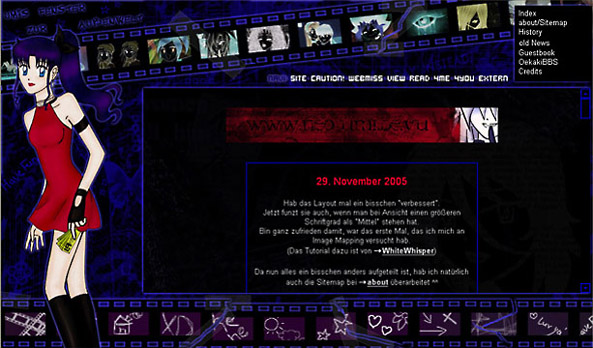
Version 2.1 - Tape (November 2005)
Two months after my long speech on how I wasn't sure I could make iframes and the like work for my main website, I couldn't hold back anymore and did it anyway lol
I grossly misjudged the amount of space I'd need for navigation purposes at first and received feedback that my navi links didn't work for some people, depending on their default browser font size etc.
I used the chance to familiarize myself with image mapping and fixed the problem in a small 2.1 update. I was really stoked about that layout, since it was so different and showed off both my art and my new webdesign knowledge.
As far as I remember I also used it as basis for a job application where I sent the company a burned CD-Rom with a version of it that didn't include all my private fandom stuff but my CV and such. Figured it couldn't hurt with them being a young startup and the job being related to animation/creative stuff in general, and I was right and got the job. It was only for the duration of one project but it introduced me to what, years later, would become my full-time RL job. Which I think is pretty cool. The power of anime! XD
Version 1.2 - Dark Blue Night (September 2005)
Had to spend the first half of 2005 mostly offline and used the time to draw and write a lot and and play around in Microsoft FrontPage some more Well, and to finish school, I guess. As soon as I had internet again, I went right back to researching how other ppl built their cool layouts, making use of div containers, pop-up windows, iframes and whatnot. But I was still wary of rebuilding my entire website with those new gimmicks in mind, thinking it could quickly feel too cramped.
So the first update after my return was rather tame and mostly concerned my "branding". Since I finally got my hands on Photoshop, I could replace a lot of stuff with my own digital art which at the time I felt looked a lot cleaner and more mature than the previous look. My fanfic website and the blog section really profited off my new webdesign knowledge though.
Version 1.1 - Dark Blue Crystal (October 2004)
My next big site/layout update was after a school trip to the U.S. where I spent a lot of the time at the school's internet café and not much time in class lol
I took inspiration from other ppl's sites and got a little bolder with text effects and Java scripts. I also finally tidied up the navigation frame and created sections for the numerous subsites I amassed by then — which now also included a little PSA about how maybe we as a German weeb society should stop stealing fanarts from Japanese artists and putting them on our own sites.
Which was. Basically what most German anime fansites' galleries at the time were made of. Just stolen fanart of ppl's favorite characters and ships with the site's url plastered on in some glowy, swirly font in size 40 or so. To prevent it from being stolen, you know.
I'm pretty sure I showed off art I "collected somewhere on the internet" too before I discovered how to find those Japanese fansites myself and suddenly felt very embarrassed that pretty much all of them had big multi-language disclaimers begging people to not reupload their stuff elsewhere, and thought maybe my peers didn't know about that. Telling them earned me flames in my guestbook and honorable mentions on ppl's hate lists. I'm sure the way I told people was pretty obnoxious but the message itself wasn't appreciated either lol.
Another little change was that I now had an extra website for my fanfic, because I was writing A Lot and felt my main site couldn't really accomodate my writing in all its glory. Also it was a great excuse to show off more of my webdesign experiments without having to update my main site yet again.
Version 1.0 - Dark Blue (July 2004)
I loved playing around and planning my homepage updates in Microsoft FrontPage and was a little bummed that not all of my little experiments would work on beepworld.
So I was pretty stoked when I realized that my mail provider at the time, freenet, offered free - ad-free! - webspace and moved my site over there. I didn't change the layout all too much at first though, except for finally labeling the navigation links lol
But I added an about me section and an Oekaki BBS (a guestbook you could draw in, Japanese, big thing on anime fansites at the time).
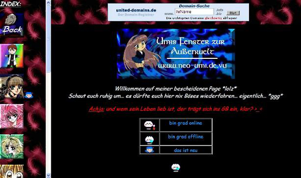
Version 0.1 - Red Feathers (2002/2003)
A year or so after launching my website, around the time I also discovered animexx.de, I gave my site its first big update.
I found out how to use frames and got really into editing pictures of Umi Ryuzaki from Magic Knight Rayearth to look like me. I still didn't own a scanner but! I finally had some kind of photo editing software on my computer which made me pretty much unstoppable anyway.
Original CLAMP illustrations, Microsoft Word cliparts, I used all of that to make my little website as pretty as possible.
I also discovered you could turn pictures into links so that's what I based the navigation on, with alt-text being the only thing that would tell you the links' destinations. Which, unsurprisingly, most visitors never figured out lol. Aside from fanfics and original stories, self insert picture edits and random other pretty pictures I found online, the site apparently also featured a list of personality tests, which were the hottest shit at the time.
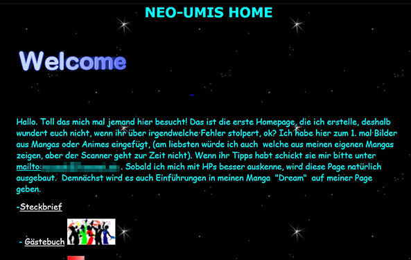
Version 0.0 - Basic Beepworld (2001)
My very first homepage ever, hosted on beepworld.de and built within their on-site editors from the comforts of our school's internet café (which was brand new at the time and consisted of like. 2 or 3 computers in some side room? I can't remember)
I mostly made it to have something to link my chatroom friends when they asked to see my writing :D I don't think I posted my art on there at the time, because I'm relatively sure we didn't have a scanner at home yet and if we did, I didn't own any programs to do something with what I scanned. Different times were different.
Got lost?